Why Does My Artwork Look Great on Screen but Not in Print?
You've designed something you're really happy with. It looks fantastic on your screen, the colours are spot on and everything seems to be in the right place. Then the printed version arrives, and something just isn't quite right. The colours look different, the images are blurry or the text isn't as sharp as you'd expected.

So, what happened?
The truth is that designing for a screen and designing for print are two quite different things. And if you don't understand the technical differences, even the best-looking design can end up disappointing when it comes off the printing press.
Here's what you need to know.
1. Screen Colours and Print Colours Are Different
One of the most common surprises when moving from digital design to print is colour. Your computer, tablet and phone display colours using RGB (Red, Green, Blue). These are created using light, which allows screens to display a huge range of bright, vibrant colours. Most conventional full-colour printing uses CMYK (Cyan, Magenta, Yellow and Black). Instead of light, these colours are created using layers of ink. The difference means some colours that look incredibly bright on screen simply can't be reproduced in exactly the same way using standard printing inks. Bright greens, electric blues and vivid oranges are particularly worth checking. This doesn't mean your printed colours will look bad. It means your artwork needs to be prepared with the printing process in mind, and colour expectations should be managed before production begins.
2. Image Resolution Matters
Ever printed a photograph only to find it looks blurry or pixelated? That's usually a resolution problem. Images displayed on websites and social media don't always need the same resolution as images used for professional print. A photograph that looks perfectly sharp on your phone might not have enough detail to reproduce well at a much larger size. For many conventional print jobs, 300 pixels per inch (PPI) at the final reproduction size is a useful target. However, the ideal resolution depends on the printing method, viewing distance and finished size. Simply enlarging a small image doesn't magically add detail. It can make the image bigger, but it won't necessarily make it sharper. Before sending artwork to print, check that your images are suitable for the size at which they'll be reproduced.
3. Vector Artwork vs Pixel-Based Images
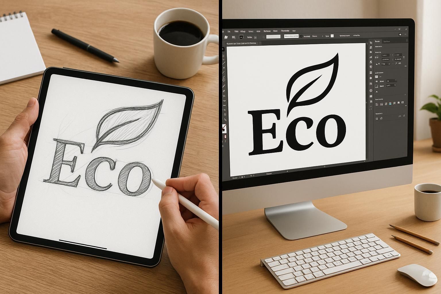
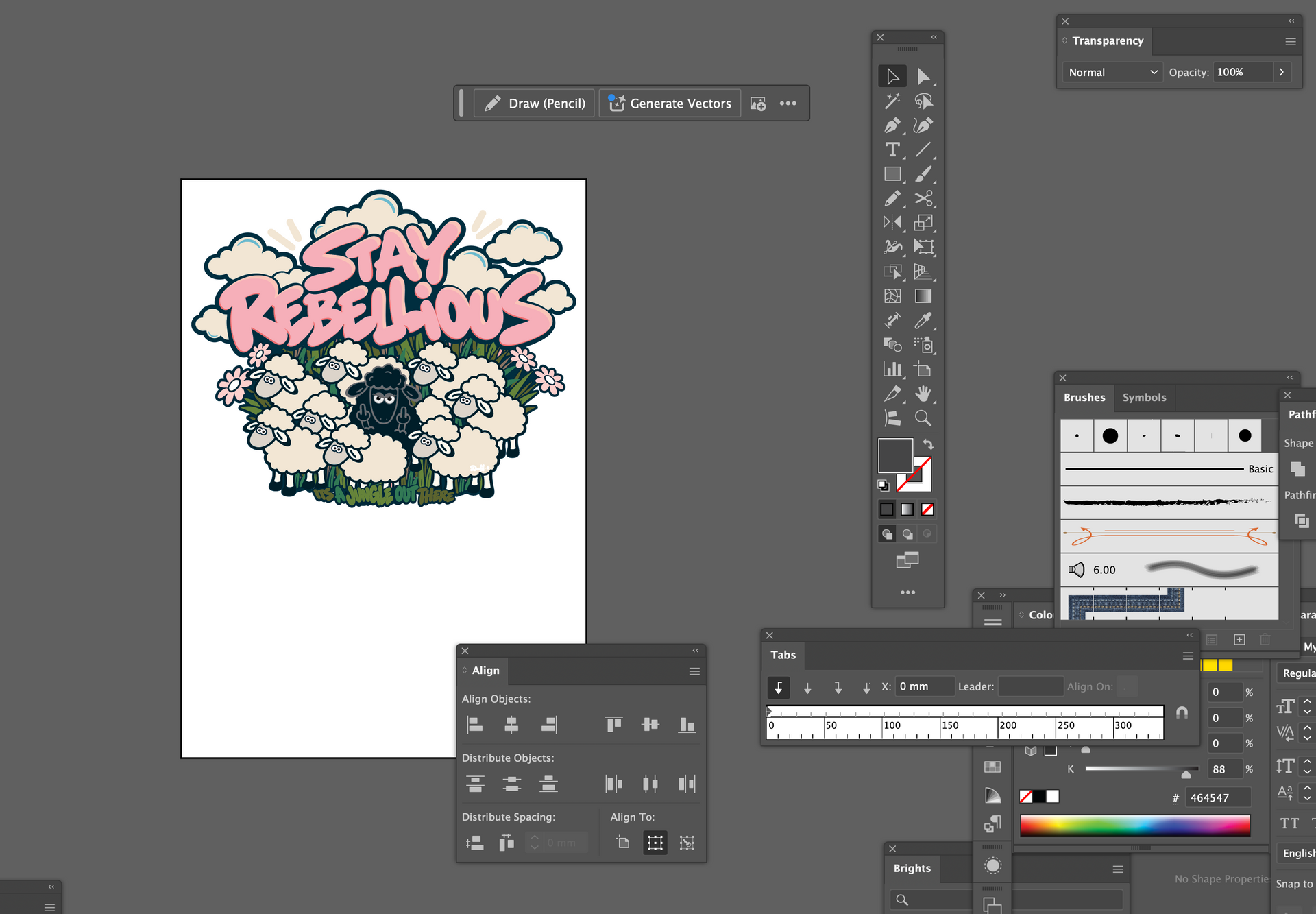
This is particularly important when it comes to logos. Most photographs and many digital images are made up of pixels. Enlarge them too much and you'll eventually see the individual squares that make up the image. Vector artwork works differently. It's created using mathematical paths and shapes, which means it can be scaled up or down without losing its sharpness. This makes vector formats particularly useful for logos, illustrations and other graphic elements. Formats such as AI, EPS, SVG and vector PDFs can be suitable depending on the software and supplier requirements. If you've created a logo using an online tool or AI image generator, check whether you've actually got usable vector artwork or simply a PNG or JPEG image. It can make a big difference when you want to put your logo on everything from a business card to a shop fascia.
4. Bleed, Trim and Safe Areas
If you're producing brochures, flyers, business cards, labels or packaging, you'll probably come across the terms bleed, trim and safe area. They might sound a little technical, but they're important.
- Bleed is the extra artwork that extends beyond the final cutting edge of a printed document. It allows for small variations during trimming and helps prevent unwanted white edges.
- Trim is the finished size of the printed item after it's been cut.
- Safe area is the space inside the trim line where important text and design elements should sit, so they don't end up too close to the edge or accidentally get cut off.
These details need to be considered when setting up artwork, not added as an afterthought.
Different printers and products have different specifications, so always check the requirements before preparing your final files.
5. Fonts and Text Need Attention Too
Typography can look very different when it moves from screen to print, particularly when text is small or a font is particularly fine or decorative. Thin lettering can become difficult to read, small text may lose clarity and certain fonts might not display correctly if they're missing from the production system. Fonts may need to be embedded in a PDF or converted to outlines, depending on the file format and printer's requirements. It's also important to check spelling, alignment, spacing and the overall layout before sending anything to production. A final proofread can save an awful lot of frustration.
6. The Material and Printing Method Make a Difference
Not all printing is the same. The result can vary depending on the material, printing method, ink, finish and even the surface you're printing onto. A colour printed onto glossy paper might look quite different when reproduced on uncoated stock. Artwork printed onto fabric can behave differently again. Packaging brings its own considerations, particularly when you're working with unusual shapes, folds, labels, sleeves or different materials. This is why it's important to understand what you're designing for before you start. A design needs to work with the material and production process, not just look good in a mock-up.
7. Always Check Your Artwork Before It Goes to Print
It might sound obvious, but checking your artwork before production is one of the most important stages of the process.
Depending on the job, this could involve checking:
- The final document size and dimensions.
- Image resolution and quality.
- Colour settings and any special colour requirements.
- Bleed and safe areas.
- Font embedding or outlining.
- Image placement and alignment.
- Spelling, contact details and other important information.
- The final PDF or artwork format requested by the printer.
For larger or more complex jobs, it's also worth requesting a printed proof or sample where possible. A proof gives you the opportunity to check how the design looks in its intended format before committing to the full production run.
Good Design Doesn't Stop at the Screen
This is where practical design experience really matters. Having spent more than 20 years working in graphic design, I've seen how important it is to understand what happens after the design itself is finished. Preparing artwork for print isn't simply a case of clicking export and hoping for the best. It involves understanding the requirements of the job, the materials being used and how the finished product will be produced. It's also about knowing what questions to ask your printer, checking specifications and spotting potential problems before they become expensive mistakes. A design might look beautiful on screen, but the real test is how it performs when it's printed, produced and put to use.
Need Help Getting Your Artwork Print-Ready?
Whether you've created your own artwork, used an online design tool or generated something using AI, I can help you get it ready for professional use. From refining existing designs and preparing print-ready files to creating artwork for packaging, brochures, promotional materials and products, Kifi Creative brings the creative thinking and technical know-how to get things right.
Good design deserves a good finish. Get in touch if you need a little help turning your ideas into professional artwork that's ready for the real world.